Color
The color purple, a regal and enigmatic hue, serves as a fitting emblem for the Independent Society of Knowledge (ISK). Just as purple is created by blending the stability of blue with the energy of red, the ISK combines the steadfast principles of scientific rigor with the dynamic spirit of innovation and collaboration.
Moreover, purple has long been associated with creativity, wisdom, and independence - qualities that are at the very core of the ISK's mission. The deep, thought-provoking nature of purple mirrors the organization's dedication to fostering deep, critical thinking and reimagining scientific inquiry. As the ISK works to provide modern frameworks and platforms for decentralized research, the color purple stands as a visual representation of their bold vision: a future where knowledge is freely accessible, collaboratively generated, and unbound by conventional academic constraints.
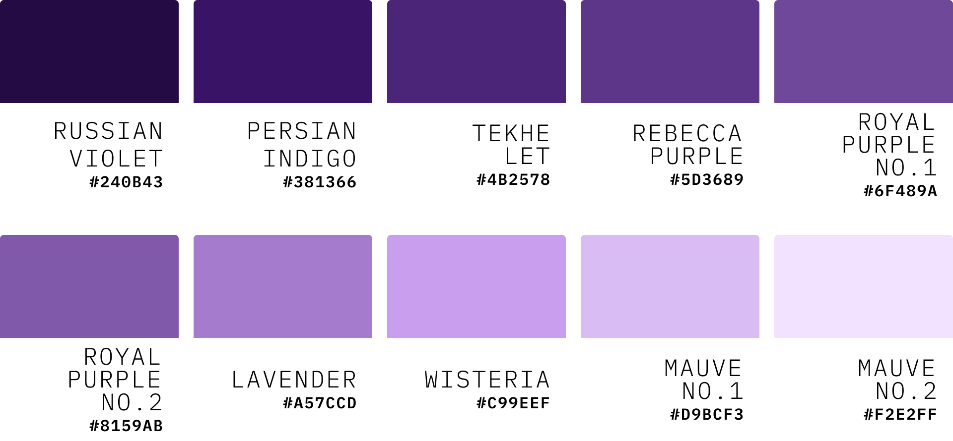
Deep Purples
Russian Violet (#240B43)

This deep, rich purple sets a strong foundation for our color palette. It evokes a sense of depth and mystery, perfect for representing the profound nature of scientific inquiry.
Persian Indigo (#381366)

A slightly lighter shade that maintains depth while adding a hint of vibrancy. This color can be used for accents or to create visual interest in designs.
Medium Purples
Tekhelet (#4B2578)

This historical shade, reminiscent of ancient dyes, bridges our deep and medium purples. It symbolizes the connection between traditional knowledge and modern innovations.
Rebecca Purple (#5D3689)

Named after web developer Eric Meyer's daughter, this shade carries a touch of legacy and community spirit, aligning with ISK's collaborative ethos.
Royal Purple (#6F489A and #8159AB)


These two shades of royal purple represent authority and wisdom. They can be used interchangeably to add variety while maintaining a cohesive look.
Light Purples
Lavender (Floral) (#A57CCD)

This softer purple adds a gentle, approachable quality to our palette. It's excellent for highlighting or for areas where we want to convey openness and accessibility.
Wisteria (#C99EEF)

Named after the beautiful flowering vine, this light purple can symbolize the growth and expansion of knowledge that ISK aims to foster.
Mauve (#CEA7F0 and #D6B6F2)


These two mauve shades provide subtle, sophisticated options for backgrounds or text. They can help create a sense of calm and thoughtfulness in our designs.
Usage Guidelines
Use deeper purples for primary elements and to convey authority and depth.
Employ medium purples for main content areas and interactive elements.
Utilize lighter purples and mauves for backgrounds, highlights, and to create contrast with darker shades.
Combine various shades to create depth and visual interest in designs, infographics, and presentations.
Grayscale Pallet
Our grayscale palette complements the primary purple tones, embodying our commitment to boldness, minimalism, and sharpness. These neutral shades provide a sophisticated backdrop that allows our primary colors to stand out when needed, while maintaining a professional and serious aesthetic.
Dark Gray pallet
Black No.1 (#000000): Pure black, used for text and critical graphic elements.

Black No.2 (#060606): A slightly softer black, ideal for large dark areas without the harshness of pure black.

Night (#0C0C0C): A deep charcoal, perfect for creating depth in designs.

Eerie Black Series
Eerie Black No.1 (#181818): A rich, dark gray for sophisticated backgrounds.

Eerie Black No.2 (#242424): Slightly lighter, used for secondary dark elements.

Jet (#303030): A medium-dark gray, balancing between black and mid-tones.

Onyx (#3C3C3C): A versatile dark gray, ideal for text on light backgrounds.

Davy's Gray No.1 (#484848): A classic mid-tone gray for body text and UI elements.

Davy's Gray No.2 (#545454): A lighter option for extended reading comfort.

Dim Gray No.1 (#606060): A balanced gray for secondary information.

Light Gray Pallet
Dim Gray No.2 (#717171): Subtle enough for backgrounds, strong enough for text.

Battleship Gray No.1 (#888888): A medium-light gray for subtle emphasis.

Battleship Gray No.2 (#9C9C9C): Ideal for borders and dividers.

Gray (#C7C7C7): A light gray for backgrounds and less prominent elements.

Silver (#B0B0B0): A metallic-inspired tone for accents and highlights.

Timber Wolf (#D8D8D8): An off-white for softer contrast against pure white.

Anti-Flash White (#ECECEC): Nearly white, used for subtle backgrounds.

Seasalt No.1 (#F6F6F6) and Seasalt No.2 (#FAFAFA): Ultra-light grays for nuanced white spaces.


White (#FFFFFF): Pure white for maximum contrast and clean design elements.

Usage Guidelines
Text Hierarchy:
Use darker grays (Black to Jet) for primary text.
Employ mid-tones (Davy's Gray series) for body copy.
Utilize lighter grays for secondary or tertiary information.
Backgrounds:
Dark backgrounds (Eerie Black to Onyx) for dramatic effect.
Mid-tones for neutral, professional layouts.
Light grays and whites for clean, open designs.
UI Elements:
Darker grays for buttons and interactive elements.
Mid-tones for borders and dividers.
Light grays for form fields and subtle separators.
Contrast and Accessibility:
Ensure sufficient contrast between text and background colors.
Use the full range of grays to create depth and hierarchy without relying solely on color.
Combining with Primary Colors:
Use grayscale as the dominant palette.
Introduce purple accents strategically for emphasis and brand recognition.